|
ARTICLES
[an error occurred while processing this directive]
|
Suppose you've just
finished
building an airplane, and now it's time to cover it. For a long
time designing the covering was the hardest part of building RC planes
for me. I just couldn't ever figure out how to put Monokote on an
airplane in a way that was original and good looking. Then I figured out that originality wasn't really what I needed. The most important factor in model plane covering is visibility. The most common cause of crashing in my early RC flying days was disorientation in the air. Sometimes I'd suffer from what I like to refer to as "silhouette syndrome", which is when you can't tell if your plane is turning toward you or away from you. Sometimes you can't tell if it's coming straight at you or flying straight away either (although the exhaust sound is a big clue). Without a helpful color scheme, either way looks pretty much the same. Back in my early days, in an effort to avoid silhouette syndrome I started putting a stripe around the right wing, chordwise, about halfway between root and tip, on every plane I built. This worked well for a while, but I realized before too long that it just wasn't very pretty. In some cases it was downright ugly. After a little bit of trial and error I came up with the color layout that solved all of my problems and has become the Standard Monokote Color Scheme for nearly every plane I build. There are just a couple of rules to follow, resulting in a plane that looks pretty snappy as well as making it apparent which direction the plane is pointed at any time. The first rule is that you need two high contrast colors, such as red&white, blue&yellow, etc. If you want to get fancy you can add an intermediate color, such as a lighter version of the dark color or a black pinstripe, in between the two main colors. The next rule is that the dark color will be prominently featured on the bottom and the front of the plane, and the lighter color will be featured on the top and rear. That's pretty much all there is to it. The result is that the plane has a distinct look depending on which way it is pointed. Here is my latest project, the RCM Basic Trainer, in red and white. Notice that when it's coming at you, you see red. 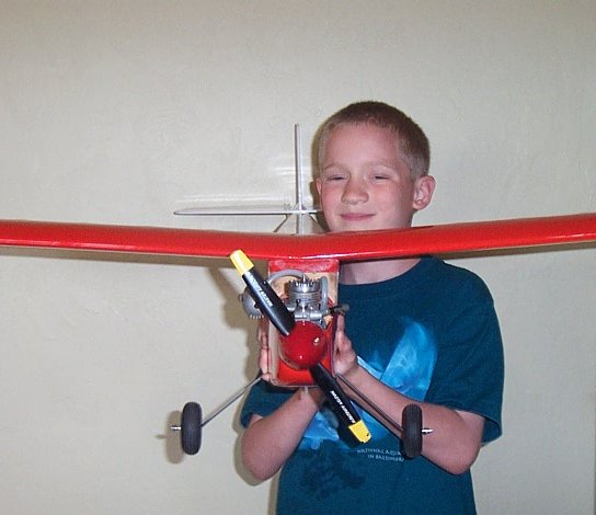 Now look at the plane as it flies away from you. You see a lot of white.  There's no mistaking that! When this plane is in the air, as with all of my planes, it's immediately obvious whether it's coming or going! But what about those situations when the airplane is flying from one side to the other, when Silhouette Syndrome is at its most dangerous? Sometimes you can't tell whether the plane is banking toward you or away from you, leading to a 50% chance of a death spiral in the next 10 seconds. In that case light Monokote on top and dark Monokote on the bottom will make it immediately apparent which way your plane is turning. When one of my planes banks toward me I see the light colored top. 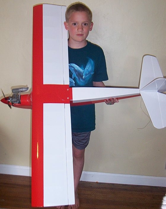 Now look at the plane as it banks away from the pilot. 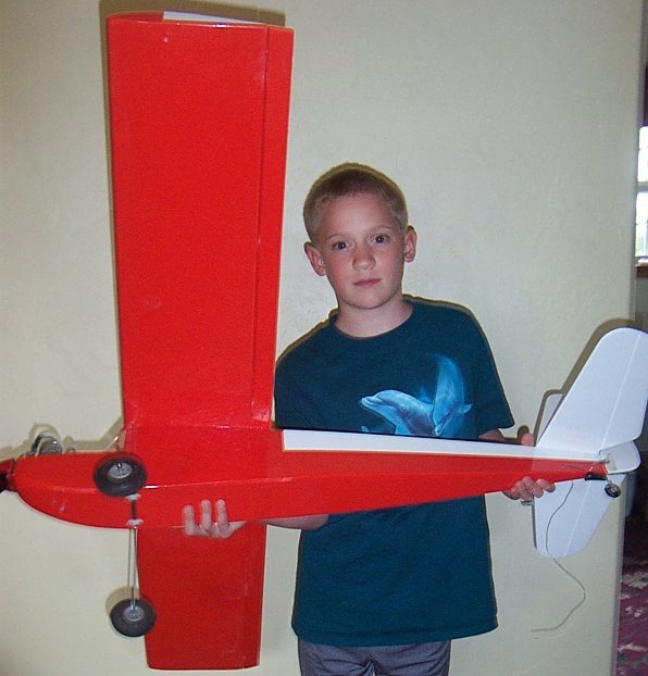 The plane turns red, leaving no question which direction it's going. Honestly, this isn't the best looking airplane I've built using this type of color scheme. Most of them look a lot better. Sometimes I like to put a dart or other shape in the cabin area where the color changes from dark to light. Here are a few examples that are a bit more snappy looking, even if the picture backgrounds look bad. Other than the classic Ugly Stick red with iron crosses, just about everything I've built since 1995 has had some variation of my standard color layout. Here's my ill-fated Lazy Ace, with a nice wavy line between purple and white.  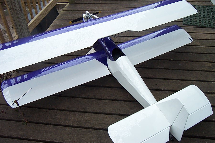 Here's a neat little seaplane called the Seamaster. I kind of liked the purple accent.  Here's a Q-Tee with a three tone color scheme:   And finally the Small Wonder: 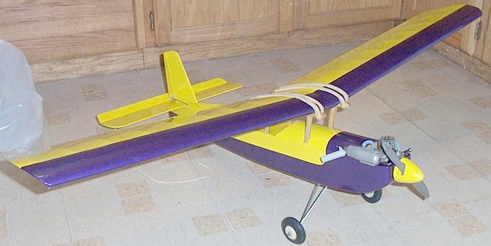 Once your eye gets used to the basic layout, you can customize your planes to give them a little bit of individual character, and you'll still always be able to tell which way they are pointed in the air. |